.svg "SpotDevLogoOrange (2)")
A recent Forbes article showed that over 50 percent of all Google searches are done on a mobile device and more than half of all UK web pages are loaded on a mobile device. Mobile browsing is becoming the norm and without a mobile friendly website you are missing out!
Despite this, many small businesses do not consider mobile-friendly websites to be a top priority. So, to help persuade any of you that haven’t built a mobile friendly site yet, we’ve got 10 more reasons you should have one.
Potential reach
It’s predicted that by the end of 2017 there will be over five billion mobile users and the biggest growth is in the rapidly growing Asian markets. Considering this, and the increased availability of 4G, a mobile-friendly website allows you to reach people everywhere.
Mobile surpasses desktop
In 2014, ComScore found that 55% of online shopping was done on mobile devices, officially overtaking desktops. The conversion rate still remains higher on desktops, at 4.14% in the fourth quarter of 2016, but tablets, especially, are closing in, at 3.56%.

Higher local conversion rate
Local searches have a high conversion rate of 78%, particularly notable for local businesses, who can gain a lot from a mobile friendly site.
Rank higher
Google is placing more emphasis on mobile usability and a mobile-friendly site will allow you to rank higher. In fact, their Pigeon update was dedicated to giving mobile friendly websites a boost in search rankings. Add in the fact that Google is starting to index mobile pages first and the SEO impact of this become clear.
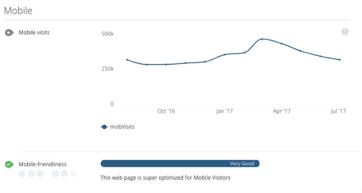
Mobile usability includes: readable text (without zooming), accessible tap targets, and no horizontal scrolling.
WooRank subscribers can check their mobile usability in their Website Review.
Mobile surpasses TV
With more time spent on YouTube and Netflix, conventional TV is being watched less and less, and this gap is widening. As a result, TV advertising is dwindling where mobile advertising dominates.
160% more likely to convert
Having a mobile-friendly site could increase your conversion rate by 160%. More impulse purchases are made on mobiles, due to the convenience, but only if your site is mobile friendly.
More purchases
Last Black Friday was the first time mobile revenue exceeded $1.2bn in one day, over one third of total sales. This is a huge market and you need to take advantage of it.
Mobile users act differently
Mobile users tend to be less patient and demand faster browsing, even a one second delay can drop sales by 7%. Your site needs to be optimised for mobile browsing.
The number one factor in optimizing your mobile user experience is making sure it’s fast. As we just mentioned, every second’s delay costs you sales. It will also cost you rankings.
Google expects mobile pages to load and render above the fold content in one second or less. This doesn’t sound so bad — you can do a lot in one second. However, the fact is that simply making a connection with your server eats up several hundred milliseconds.
Optimize your mobile speed by eliminating redirects, loading assets asynchronously and reducing image sizes when possible.
Or, if your site mostly focuses on publishing content, consider using Google’s AMP framework to optimize mobile page speed.
Mobile advertising
People spend more and more time on their phones and a good advert is one that people actually see. Mobile adverts need to be prioritised over TV and other media. However, the way you implement mobile advertising on your pages will have a big impact on your site’s mobile friendliness.
Simply put, Google really doesn’t like pop-up ads appearing on mobile pages. So much so that they’ve actually created a ranking penalty for pages that use “intrusive” ads.
Google defines “intrusive” as pop-ups that:
- Cover the main page content immediately after a user lands on the page or while they are scrolling through the page.
- An interstitial ad that must be dismissed before accessing the page.
- Using a design or layout where the above the fold content looks and behaves like an ad or interstitial, even when the content has been inlined.
They’ve provided some handy examples of what each of those look like in practice: However, if you need to use pop-ups in certain situations (cookie warning, age gate, app download, etc.), there’s still a way you can incorporate them into your website when necessary.
As long as you follow the guiding principle of not blocking users from accessing content on the page, you should avoid a penalty.
Brand boosting
Having a mobile-friendly website can also offer big help in a more subtle, less tangible way: by matching your website up with your audience during a micro-moment.
A “micro-moment” is the moment a person uses their mobile device (usually their phone) to achieve an instant result. A result includes finding specific information, making a purchase or doing research.
Reaching your audience during their micro-moments can be very valuable from a branding perspective. Consumers are constantly flooded with ads in all shapes and forms: video, display, text and content. And they’ve mostly learned to tune all that out.
However, by engaging a user during a micro-moment, you’ve established a value-based exchange with them. They now see you as someone they can turn to to get something from.
This trust is very important when it comes time to convert them into a lead or sale.
Get optimising
So, now that we’ve told you why you should be doing it, here are seven tips for optimising your website to make your pages more mobile friendly:
- Be adaptable to different screen resolutions.
- Readable information without zooming.
- Be aware of what information is above the fold.
- Minify code, number of redirects and optimise images for speed.
- Vertical scrolling only!
- HTML5 over Flash guarantees compatibility.
- Develop a mobile strategy. What do your users want from your mobile site?
While the focus of mobile friendliness is usually page speed, and rightfully so, there are a lot of technical and UX factors that go into a fully mobile friendly page. Your best tool in this situation is an SEO audit that will inspect each aspect of mobile friendliness to give you the most accurate picture.
This guest post was written by Courtney McGhee, Marketing & PR Executive at WooRank, providers of SEO audit software that helps you to analyse and optimise your website.
Our content includes affiliate links. This means that we may receive a commission if you make a purchase through one of the links on our website. This will be at no cost to you and helps to fund the content creation work on our website.