Top 5 Website Design Trends We Have Seen So Far In 2017
Top 5 Website Design Trends We Have Seen So Far In 2017
Get weekly
HubSpot Updates
Website design is about far more than simple aesthetics. It incorporates user experience and, ultimately, how well your site's visitors are going to convert.
Now that we are over halfway through 2017, let’s take a look back at some of the design trends we have seen for far in 2017.
Modular
https://www.curioos.com/
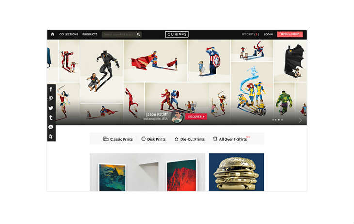
Curioos use a simple and clean modular layout that lends itself well to gallery pages and online stores.
With the Growth-Driven Design (GDD) trend starting to take hold, designers have started to favour modular design, allowing them to add and remove sections without a large impact on their overall layout.
Modular design also lends itself to scaling, which makes it faster and more efficient to create responsive design layouts.
Semi-flat
https://rentberry.com/
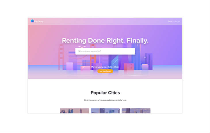
Rentberry use a subtle drop shadow to highlight key elements and guide users on their journey through the site.
Over the past few years the flat style for website design has been extremely popular, and in 2017 it is still heavily used.
However, it has started to evolve, with the addition of light and shadow making it appear ‘semi-flat’. This depth also lends itself to page animation and transitioning, which brings me into my next trend....
Movement
http://www.thebeekman.com/
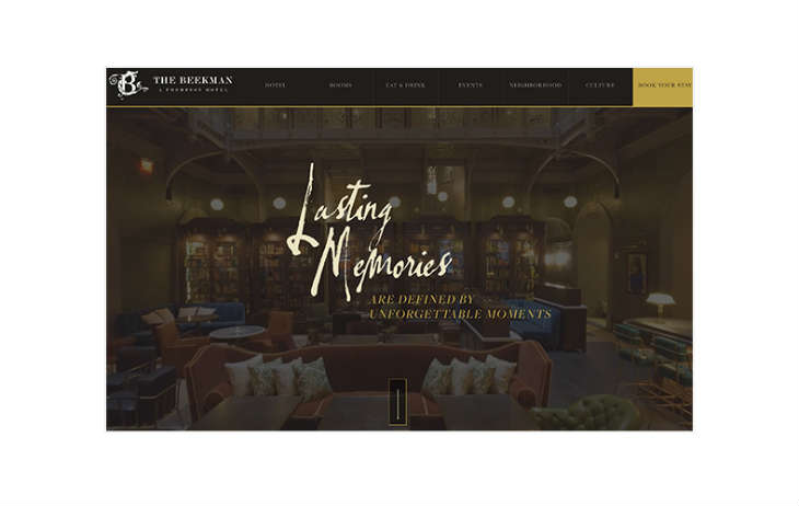
Using video content as the background shows off the elegance and grandeur that The Beekman offers its customers.
What is the best way to draw someone's attention? Movement.
Movement might have started off with little page transitions and animated GIFs, but it has become a fundamental part of website design and digital marketing, drawing people's attention to buttons and banners. Also, with the quality of mobile phone cameras increasing significantly, it has become a lot easier for people to create high definition video content in no time at all. This video content can then be embedded into websites or used to create ‘cinemagraphs’ (still images with one element of it being an animated loop).
Vibrant Colours
http://fotonaut.cz/en/
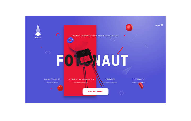
The Fotonaut site really stands out as being fun and creative with its bold use of colour.
In previous years designers have gone with simple and clean colour palettes, sticking to whites and grays.
In 2017, designers have started to look to more bold and vibrant colours with the aim of drawing users’ attentions to ‘Hero’ banners, CTAs (calls-to-action) and content offers. This trend is definitely growing and pages are becoming even more colourful, with colour transitions also becoming a popular choice when adding colour.
Landing Pages
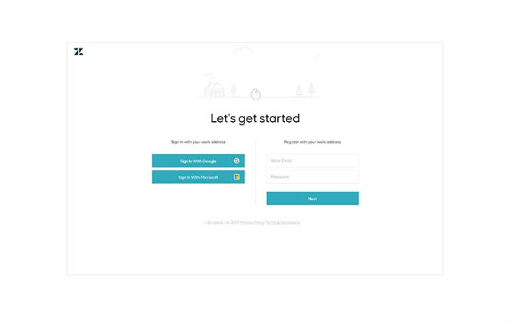 https://www.zendesk.com/register/#getstarted
Keeping things simple for users is often the best policy, and Zendesk achieves that with its simple and clean design, only using colour to highlight sign-in CTAs.
Landing pages are another great tool that allow marketers to better target visitors and drive conversions, promoting campaigns such as special offers and free content.
Landing pages are a lot more direct than a website as they focus on a singular action, which can in turn drive conversions since the user isn’t distracted by anything else that might appear on a full site.
Let me know what you think in the comment section below. Have you seen any other website design trends this year that we haven't mentioned?
Not sure if your website is working as hard for you as it could be? Request a free website audit from one of our digital marketing experts.
Our content includes affiliate links. This means that we may receive a commission if you make a purchase through one of the links on our website. This will be at no cost to you and helps to fund the content creation work on our website.